-
- Contact
- •
- About
- •
- Coloring Book
- •
- Gallery
- •
- Home
-


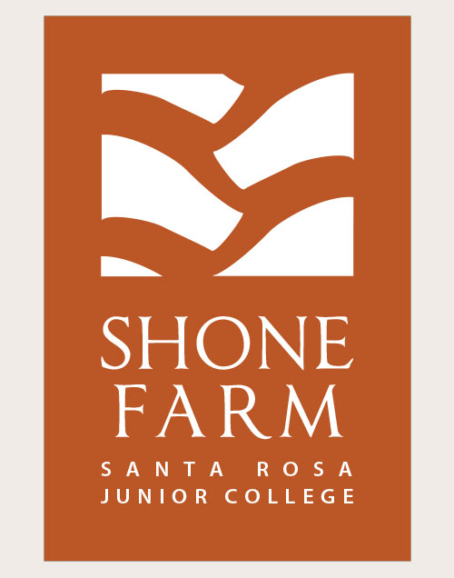
I was honored to be chosen to design the logo and wine label for Shone Farm, the Santa Rosa Junior College agricultural and natural resources teaching facility.
The logo is to be used in a variety of ways from simple, such as letterheads, to sophisticated, such as wine labels and packaging for high end agricultural products.
The design brief for the logo required it to be "clean and distinctive" with an abstracted agricultural reference. Design roughs were centered on the idea of using the abstraction to create a logo that could be "read" in more than one way. This design was inspired by the tires of one of the tractors on the farm. It can also be read as hills and valleys.
Colors were designated to be earth tone and to have "sophistication and weight". The color chosen is a subdued rust color leaning toward red with type and logo in white.
Illustrator was used to create this logo.
Logo © Shone Farm.

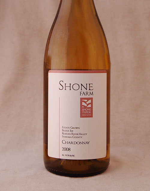
The requirements for the label were for it to be competitive and in the design style of the top 20% of the market. This project spanned the design process from sketching thumbnails to approving proofs of the final label.
This Chardonnay was the first commercial vintage produced by Shone Farm.
Label design © Shone Farm.
Get in touch and let's talk about how I can help you with your marketing.
email: Wernicke Studio